

ROLE: Lead UX Designer
Duties: Field research, stakeholder alignment, interaction design, user flows, UI handoff
PROBLEM
NAPA's delivery operation ran on paper and memory. Drivers carried clipboards. Dispatchers managed physical boards of keys and invoices. The moment a truck left the lot, the dispatcher had nothing until it came back.
Digitizing that operation sounds like a straightforward technology problem. It wasn't. The real problem was the people doing the work. Drivers were retirees and part-timers who'd been running the same routes for years. They knew which delivery bays had broken buzzers. They knew which customers only showed up after 10am. None of that lived in any system. It lived in their heads, and the paper worked just fine for them. Any tool that added steps, demanded attention during a drive, or felt like someone watching over their shoulder was going to end up on the seat and stay there.
That's the actual design problem. Build something digitization requires without building something the users refuse to use.
RESEARCH
I did ride-alongs. That's where you find out what's actually happening versus what the brief says is happening.
What I saw: drivers juggling coffee, keys, and a clipboard while running routes they had completely memorized. The paper manifest was mostly a formality. The real route was in their heads. Stop order, customer quirks, which back entrances to use, who to call if no one was at the dock. Years of accumulated knowledge that never got written down anywhere.
Dispatchers had a separate problem. Once a truck left, they went blind. If a priority customer called asking where their part was, the dispatcher had two options: call the driver, which the drivers hated, or guess. They had a name for it. They called it the black hole.
Two users. Two distinct problems. One tool had to work for both.
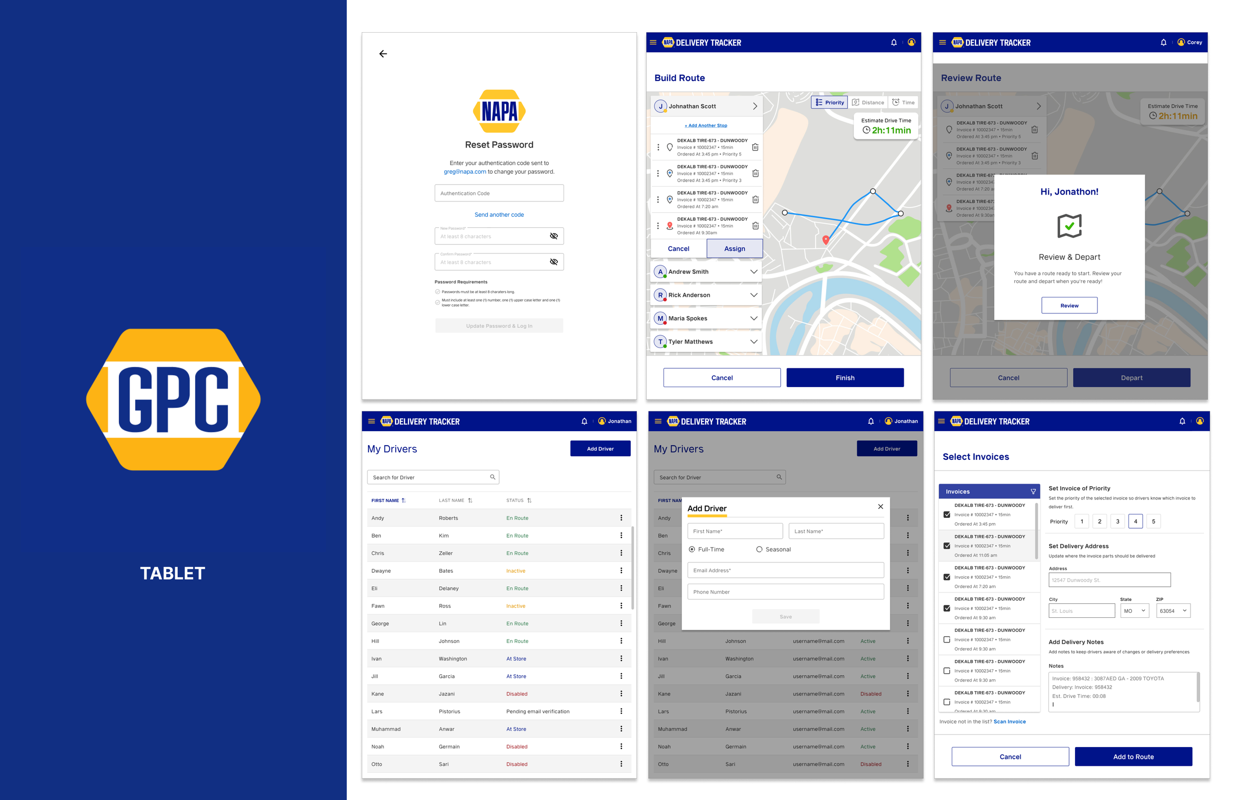
THE PIVOT
The original brief called for a delivery management app where drivers logged every step. Arrived. Unloading. Signed. Departed. Four taps per stop, every stop, all day.
One week of research made it clear that wasn't going to survive contact with the actual users. These drivers weren't going to tap through a four-step confirmation flow while standing at a loading dock. The tool would get ignored, and the data the business wanted would never materialize.
The harder conversation was with stakeholders. Those manual input fields were tied to reporting requirements, which meant cutting them required going back to leadership and making the case plainly: a tool with zero adoption produces zero data worth having. We moved from a data input model to a background utility. Passive tracking. Automated status updates. The driver's interaction with the app would be minimal by design.
HARD DECISIONS
Stakeholders wanted continuous location tracking. Research said drivers who felt watched would reject the tool outright. The compromise: contextual tracking, active only during an active route, visible to the driver on their own screen. They could see what was being shared and when it stopped.
That transparency was load-bearing. This was a user population with real reasons to distrust new technology. Showing them exactly what the app knew and when it stopped knowing it was what kept them from treating the whole thing as surveillance.
The first prototype was map-first. Familiar from consumer apps, easy to justify in a design review. It failed immediately in testing. These drivers knew their areas cold. A map gave them nothing they didn't already have. What they needed was the manifest: confirmation that the right parts were in the truck for the right stops.
I flipped the hierarchy. A context-aware single card. Driving showed next stop details. Arriving surfaced the scan button, front and center. The driver never had to decide what to do next. The app just showed them the one thing that mattered at that moment.
OUTCOME
Dispatchers got real-time visibility into driver status during active routes. The black hole closed.
Drivers called the tool easier than the clipboard. Not because it had more features. Because it had fewer decisions. The app handled the steps that used to require attention and got out of the way for everything else.
Automated status updates cut the check-in calls that drivers had always hated. The tool that was supposed to increase management visibility ended up reducing the most intrusive form of it. That's a good outcome. The kind you only get when the research shapes the design instead of the brief shaping the research.