

Role: UX Design, information architecture, component system design
The Challenge
CoStar owns the data commercial real estate people need to make decisions: property comps, market trends, neighborhood details, transaction history. That depth is what makes the platform valuable, and depth is exactly what was making it hard to use.
The data lived in tables seventeen columns wide. Reading one meant scrolling horizontally, holding several numbers in your head at once, and trying to remember what you saw two columns back while your eyes were already three columns further along. Dense information doesn't bother a specialist, they expect it. What actually breaks the experience is a layout that makes someone work harder than the data requires. A user's attention was going to navigating the table instead of analyzing what was in it, and that's the real gap between having good data and being able to use it.
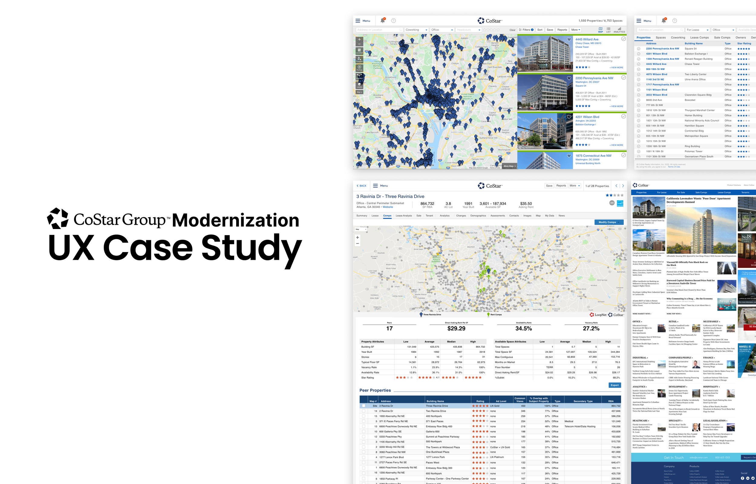
The Design Decision
I moved the information into cards, and the reason wasn't visual trend-chasing. Cards read top to bottom instead of left to right. Related numbers sit together instead of being scattered across a row a person has to keep re-scanning. The eye stops hunting for context it already passed.
One constraint governed everything else: keep all the information. Reorganizing structure so it does the cognitive work instead of the user is a real simplification. Deleting data to make a screen look cleaner isn't, it's just a worse version of the same problem.
Three things had to work together to make that true. Visual hierarchy that puts the number that matters most at the top, with context below it and white space doing real work, so a glance tells you what's primary before you've consciously thought about it. Vertical movement instead of horizontal, so comparing five properties becomes reading five cards down a column instead of turning your head sideways five separate times. And precision that never gets sacrificed for the sake of a cleaner-looking screen, built as small, composable pieces, a card for a single data point, a card for a ratio, a card for historical data, the same underlying data taking different shapes depending on the question someone's actually trying to answer.


The Approach
Getting there meant changing the architecture underneath, not just the surface layout. A broker looking at a single property needs something different from an analyst building a market report, and both of them are pulling from the exact same underlying data. The system needed to present that data differently depending on what someone was actually trying to do with it, which meant the components themselves had to be broken into pieces small enough to recombine.
A table is monolithic, one fixed shape for every use case. Cards are composable, which meant building a real component library instead of a page layout, then letting those components combine differently depending on context. That only works if the rest of the experience holds still around it. A filter behaves the same way on every screen. A drill-down gesture behaves the same way everywhere it appears. Learn the interaction once, and it applies across the whole platform instead of resetting every time someone moves to a new view. Desktop and mobile needed to feel like the same product rather than two different ones, cards reflowing while the information hierarchy underneath stayed intact. And when someone clicked into a detail view or switched datasets, the layout needed to shift without breaking their sense of where they were, since that continuity is what lets someone move fast without getting lost in their own tool.


Evidence of the Architecture

The Results
The new system made information faster to read, and that sounds simple until you sit with what it actually meant in practice. Comparing five properties went from minutes to seconds. Market signals became visible at a glance instead of requiring a mental spreadsheet held together by memory. Complex data stopped feeling like a puzzle to decode before you could even start thinking about it.
A property card, a market card, a timeline, different formats built on the same underlying system. Someone learned the pattern once, and that learning carried across every part of the platform instead of resetting screen to screen. And because the building blocks were genuinely composable, the framework could grow. When CoStar needed new data types or new workflows, the atomic pieces were already there. New combinations of existing components, not a rebuild from scratch.
What I'd Tell the Next Person Doing This
CoStar's real advantage was always its data, not its interface, so the work was never about touching what the data said. It was about getting the interface out of the way so an analyst could think about real estate instead of thinking about how to operate the platform. That distinction matters more in a domain like this than almost anywhere else, because the people using it are making decisions on a deadline, and the faster someone gets from a question to a confident answer, the better that answer tends to be. Reorganizing structure so it carries the cognitive load instead of the user is the only kind of simplification that actually holds up under that kind of pressure.