

Role: Solo designer and engineer, end to end, from concept through a deployed design system
Platform: macOS (Electron)
Stack: React, TypeScript, Tailwind, Radix UI, Google Gemini
Live artifacts: Deployed Storybook · GitHub
At a glance:
Designed and built a macOS file organizer around a single trust-first interaction principle: nothing moves until you've seen exactly what will
Made AI an optional collaborator, not a requirement. The app runs fully without it and drops to a local heuristic with no API key
Shipped a working, signed macOS app, then went back and extracted a full design system from it: 11 tokenized, accessible components with a deployed Storybook
Caught and fixed a real, silent accessibility regression during that later audit
The Problem
I spent two years getting paid to design AI people would trust. Human-in-the-loop workflows, transparency, the whole toolkit. Then I'd go home to a Downloads folder I'd given up organizing months earlier, because every auto-organizer I'd tried had the same failure mode. It worked fine, right up until it took a file I needed and put it somewhere I'd never think to look. Lose twenty minutes finding it, turn the tool off, never open it again.
The sorting was never the hard part. Every tool in this category can already move files by type or date or name. Nobody had solved the actual problem, which is trust. People are protective of their files in a way they aren't protective of most software, because losing something has a real cost, and handing that decision to an app you don't fully believe in feels like losing control of your own desk.
So the brief I gave myself wasn't a better sorting engine. It was: build the thing that makes someone comfortable enough to let automation near their files at all.
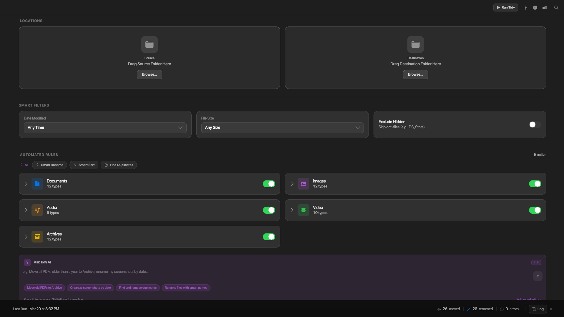
Preview Before Action
One rule runs the whole app. Before a file moves, you see exactly what's about to happen. What goes where. What collides. What's a duplicate. Then it waits for you to say go.
Once someone knows they'll always get to look before anything happens, you can hand the tool more responsibility, not less. Let it watch a folder. Let it suggest rules on its own. Let someone describe what they want in plain English instead of clicking through a form. None of that gets scarier once the preview step exists, because the worst case is just "I saw the plan and said no."
Making Rule-Building Conversational
Every competitor in this space builds rules the way a database would. Pick a field, pick an operator, pick a value, repeat. Fine if you already think that way. A wall for almost everyone else.
Tidy lets you type or say what you want, move all the screenshots from last week into Archives, and an AI-assisted parser drafts the rule. Here's the part that matters. The model never gets to act on its own draft. It hands back an editable, visual rule in the same builder you'd use by hand, and you confirm it before anything is saved.
The AI never gets to touch a file. It only ever gets to propose.
That's the same principle as the preview sheet, just moved one layer back. Draft, don't decide. It shows up again later, in a smaller and more honest way, in a color that can't legally pass as text.
AI as a Guest, Not a Requirement
The language features run on Google's Gemini API, and the decision I'm proudest of here is the one almost nobody will consciously notice. Tidy runs completely without it. No key, no account, no signup wall. Miss the key and the app falls back to a local heuristic that handles the obvious cases with no language model in the loop at all.
The intelligent layer is a guest in the house. It helps when you invite it in. The house still runs fine if you don't.
The Visual Language
Tidy is built to feel native to macOS, not like a cross-platform app in a Mac costume. Layered translucent materials, a background that shifts with whatever's behind the window, light and dark themes that follow the system, one accent color you can swap between blue, green, and purple instead of a brand color bolted on for identity's sake.
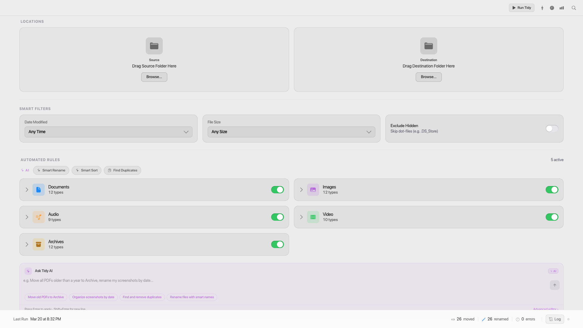
Scheduling handles recurring cleanups on a time picker. An insights layer notices patterns in a folder before you think to ask about them. And there's a built-in accessibility panel with an audit log, which mattered a lot more than a checkbox feature once a later audit found a real bug sitting quietly inside it.
The Build
Electron, React 18 and TypeScript on Vite, Tailwind and Radix UI underneath. I designed every layer of this and wrote the code that ships it.
Shipping it turned up an honest, slightly funny problem. Ad-hoc signing means the first time this app opens on a new Mac, the operating system flags it as damaged and refuses to run until you clear it by hand in Terminal. A trust-focused app, and the very first thing macOS says to a new user is don't trust this. I didn't design my way out of that one. It's a real limitation, sitting plainly in the project's own README instead of hidden.
Going Back In
I shipped the app before I ever looked closely at how consistently it was built. It worked, so I moved on. Going back in later to formalize the interface into a real system, the audit turned up something a little embarrassing. The same handful of elements, rebuilt slightly differently, over and over. Seven opacity values faking the same translucency effect. Nine corner radii where five would've done the job.
None of that was visible to a user. That's exactly why it mattered.
Nine radii. Seven opacities. One decision, made repeatedly.
Every value below was pulled directly from the shipped app. Toggle the switch to see what applying design tokens actually does to it.
Why this matters: with tokens applied, every swatch outlined in blue now shares one of five named values. Change --radius-lg once, and every card, dialog, and panel built on it moves together. Before tokens, that same change meant finding and editing nine separate places by hand.
Same pass found something I couldn't fully fix. Apple's own system yellow and orange cannot pass WCAG AA contrast as text on a light background. Not a bug. A fact about the color. I wrote that down instead of faking a passing grade, and split the tokens so the real color still carries the fills while a separate, darker token handles anywhere that color needs to be read.
Which accent colors survive as text?
Real WCAG AA contrast measurements from the Tidy accessibility audit. Hover a swatch to preview it as text. Toggle to see the same colors against a dark background.
What this shows: yellow and orange are Apple's own HIG accent colors, and neither can reach 4.5:1 as text on a light background. That's a property of the color itself, not a bug. Both pass comfortably in dark mode, which is why Tidy keeps the true accent for fills, and reserves a separate, darker token for anywhere that color is used as legible text.
That bug is the clearest example in this whole project of what an accessibility audit is actually for. You can design trust into an interaction and still, months later, quietly break the one feature built for the people who need it most, with no visible symptom at all. The fix is going looking on purpose.
The Result
A shipped macOS app built around one non-negotiable rule, and a formal, tokenized, accessible system extracted from it afterward. Eleven components. A deployed Storybook. A documented account of what the audit found, the parts that are fixed and the one part that still isn't.
What I'd Tell the Next Person Doing This
Building the system after the app, instead of alongside it, meant I found more than I would have otherwise. The inconsistency only exists if you build first and audit later, and that inconsistency turned out to be the most useful part of the whole project.
Next time, the token layer goes in before the first screen gets designed, not after the product ships. That's the real lesson here, and it's the one I'm carrying into the next project.