
I built this for myself. That's the honest answer to why it exists.
I had a Python script I was running from the terminal to download videos, and it worked, more or less, if you didn't mind typing flags from memory every single time and had zero visual feedback about whether anything was actually happening. It was the kind of tool that only works if you built it, the kind where you're the only person who knows the incantation required to make it go.
So I decided to fix that. What started as "I'll add a simple interface" turned into a full redesign of the entire thing: UI, backend, architecture, AI integration, the works. I did not plan for it to go that far. But that's how these things go.
The Problem
The original CLI version had three real problems.
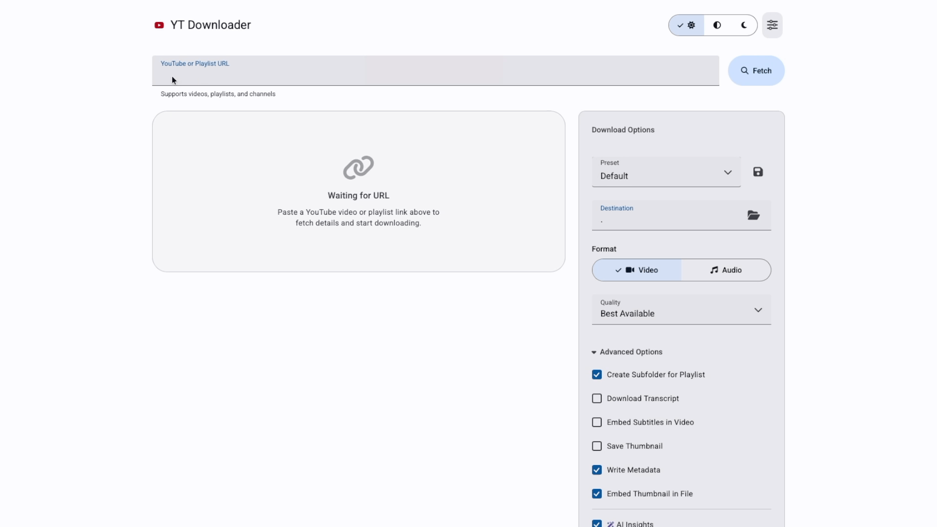
No feedback loop. You ran a command, it did something (maybe), and then you went to check the folder. No progress bar, no visual confirmation, no history. You'd launch a download and have no idea if it was halfway done or had already errored out two minutes ago.
No persistent configuration. Every session started from zero. Format, quality, destination directory, authentication: you re-entered all of it every time. Reasonable for a tool you use once. Brutal for something you use weekly.
Zero approachability. The only person who could use this tool was someone who already built it. A UX designer with enterprise product experience building a personal tool that only a developer could operate is, I'll be honest, a little embarrassing.
The goal was to fix all three. A real interface with real feedback, persistent settings, and enough design thinking behind it that someone other than me could pick it up and figure it out.
Why Material Design 3
I know those design systems well. For this project I wanted to work in M3, Google's current design system, partly because it was the right fit for a web-based utility tool, and partly because I wanted the practice.
M3 gives you a lot: a tonal color system built around surface elevation, semantic color roles, clear component hierarchy, motion principles. What it doesn't give you is a pre-assembled layout. You still have to make the decisions about information architecture, component selection, and how each panel relates to the others.
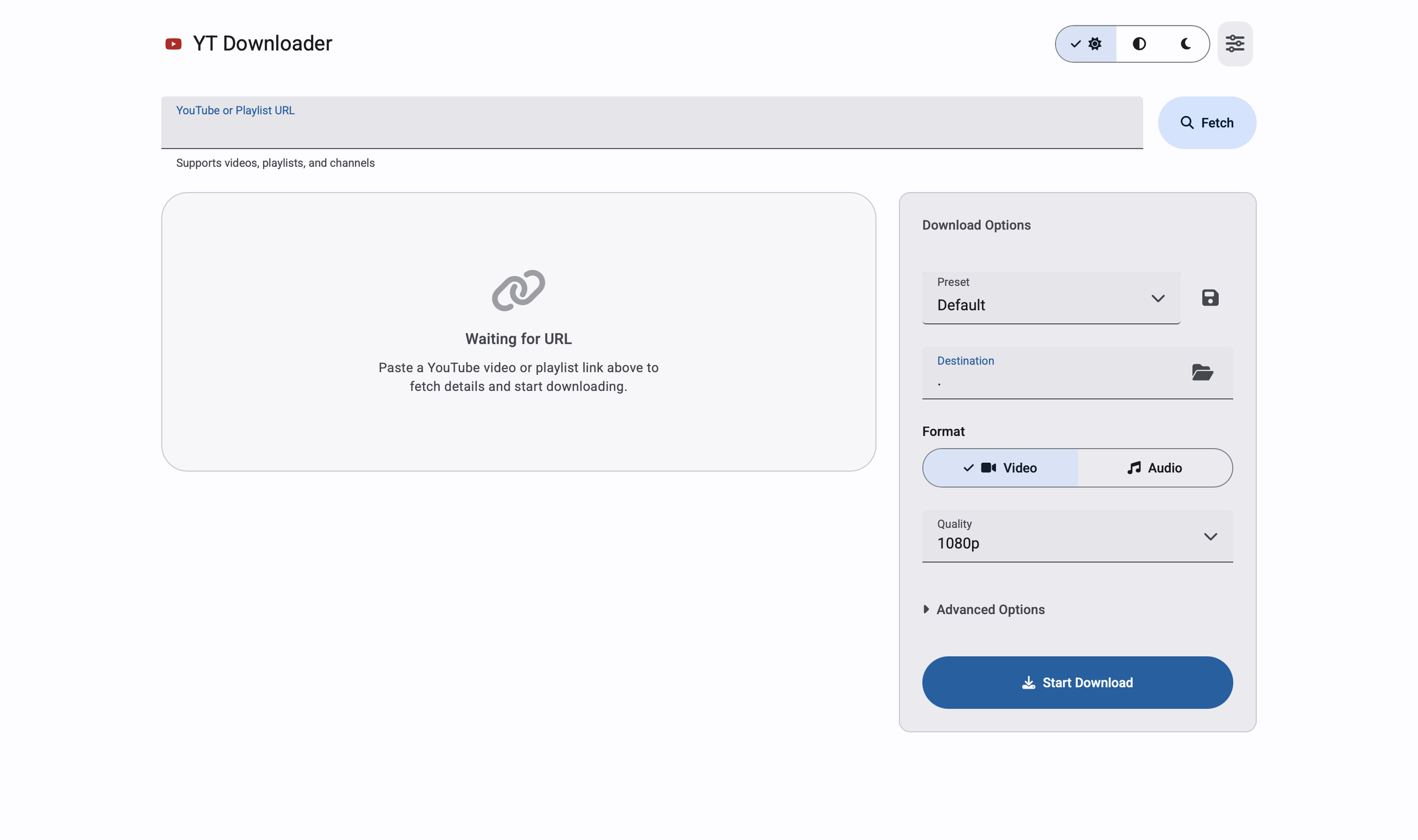
The layout I landed on is a two-column responsive grid: left column for video preview, playlist details, active downloads, and history; right column as a persistent options panel. The destination field, format toggle, quality selector, and advanced options all live on the right. That way the user never loses track of their settings while scrolling through playlist items on the left.
Small things that took more iterations than they should have: getting the URL input field and the Fetch button to sit side by side at the same height, keeping error states below the input row instead of inside it, making the theme toggle immediately accessible in the header instead of buried in a Settings modal. None of those are glamorous. All of them are the difference between something that feels designed and something that feels assembled.
Real-Time Feedback
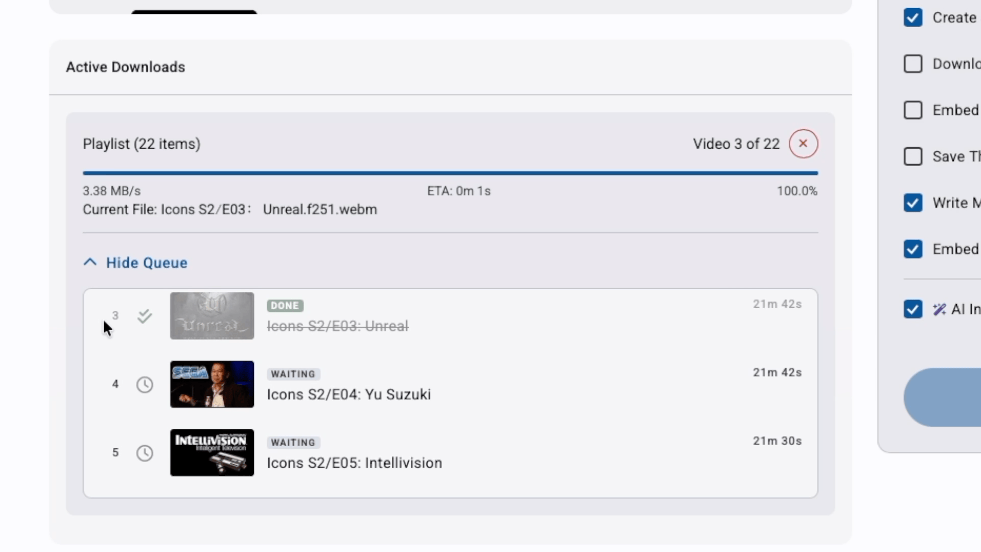
The biggest UX gap in the original tool was silence. You started a download and had no idea what was happening until it was done or wasn't.
The redesign puts a live download item in the UI the moment you hit Start. Progress bar, download speed, ETA, current filename, processing status: everything updates in real time over a persistent connection between the browser and the server. When the download finishes, the item updates. When it errors, it tells you. When you cancel it, it stops and says so.
That feedback loop is the core of the experience. Everything else is options and configuration. This is what makes it feel like a tool instead of a black box.
The AI Layer
Two AI features, both using the Gemini API, both scoped specifically to what the tool actually does.
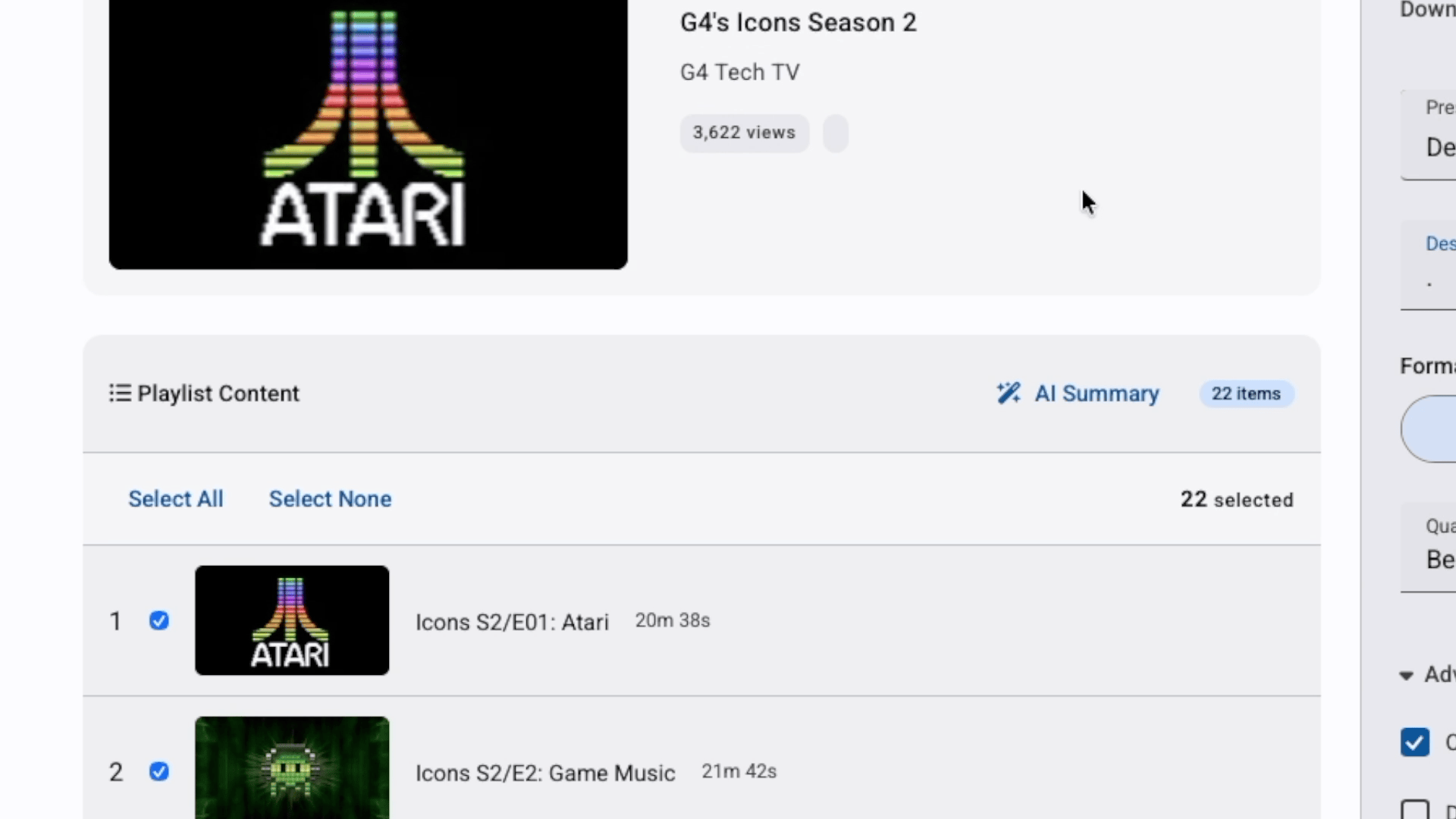
AI Insight for single videos. When you fetch a URL, the app sends the title and channel to Gemini and surfaces a one-sentence description of what the video covers. It appears in the preview card before you download. The use case: you paste a URL you don't fully remember, and you get a quick read before committing to it.
Playlist summarizer. For playlists, an AI Summary button sends up to 100 video titles to Gemini and returns a few sentences on what the playlist covers overall. Useful for evaluating a large playlist before deciding whether to download the whole thing or filter it down.
Both are optional and gracefully degrade. No API key configured, the features stay hidden. The core download functionality is entirely independent.
What I deliberately didn't add: anything that would require downloading content before you'd decided to download it. Every AI feature I considered and rejected failed the same test: added complexity without making the primary task easier.
The Presets
Presets were one of those features that sounded minor and turned out to matter more than expected.
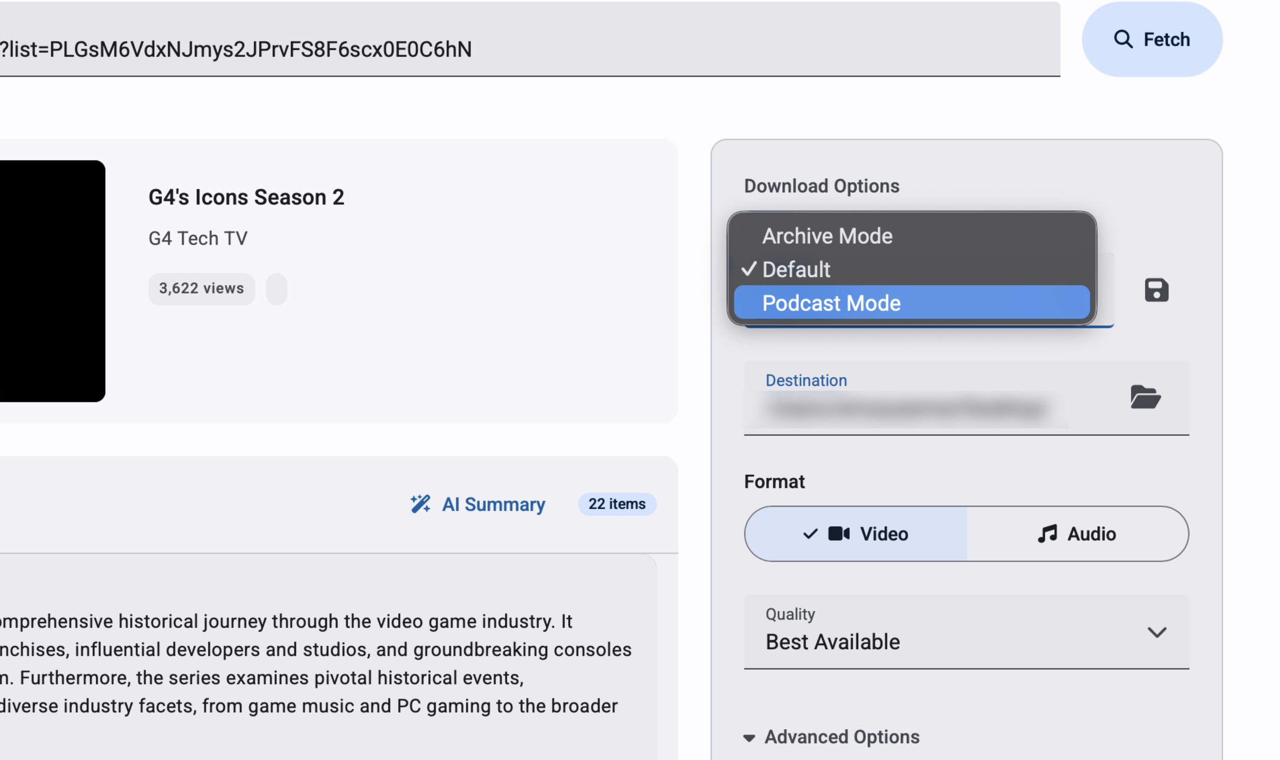
The three built-in presets (Default, Podcast Mode, Archive Mode) each represent a complete configuration: format type, quality, metadata options, subtitle behavior. Selecting one resets all the controls at once. Switch from "downloading a video for reference" to "archiving a podcast with embedded thumbnail and metadata" in a single click instead of touching six separate controls.
Default is explicit about what it does: video, 1080p, thumbnail on, metadata on. A preset that does nothing when you select it is just a label. This one actively resets the form to known values, which matters when you've been customizing settings and want to start clean.
Users can save their own presets by name. The saved preset persists across sessions and appears in the dropdown. Small feature, real value for anyone with consistent use patterns.
What I'd Do Differently
A few honest ones.
The options panel carries too much. Format, quality, destination, subtitles, transcripts, metadata, thumbnails, AI toggles: it's all there, and that's a lot to parse for a user who just wants to download something. A progressive disclosure approach, where basic settings are visible by default and power-user options live behind an expandable section, would make the first-time experience cleaner without removing anything.
Authentication needs a visible first-run step. Right now the app handles YouTube's access requirements behind the scenes, which works on my machine but will fail silently for anyone else depending on their setup. Making that step explicit and configurable would be the difference between a personal tool and something distributable.
Error messaging could be more actionable. "No files were downloaded" is accurate but doesn't tell the user what to do about it. A more specific error state with a suggested next step would close that loop.
The Actual Takeaway
Building this forced me to sit on both sides of the designer-developer line in a way that client work rarely does. On client work, you hand off specs and trust the engineering team. Here, the specs were mine, the bugs were mine, and the pressure to ship was also mine. That's a different kind of accountability.