
Apple Store Design Psychology: What's Really Going On in There
I've spent enough time in Apple Stores to have a theory. Walk in off the street, and within sixty seconds something happens to your body. The shoulders drop. The pace slows. You're touching things you didn't come in to touch. Nobody's asked you anything yet. Nobody's following you around with a badge and a quota. You just... relax. And then you spend six hundred dollars on a laptop stand.
That's not an accident, and I've thought about why it works.
When Steve Jobs announced Apple would open retail stores in 2001, BusinessWeek printed a headline I still find remarkable: "Sorry, Steve, Here's Why Apple Stores Won't Work." Predicted they'd fold in two years. The logic was sensible: computers were commodities, sold through big-box retailers, and nobody opens their own chain to compete with CompUSA. That was the conventional wisdom.
From what I can tell, here's what the conventional wisdom missed. Jobs wanted to rebuild the entire relationship between a customer and a product from scratch, and the transaction was incidental to that. Everything after that follows.
The Warehouse Nobody Knew About

I mean, before a single store opened, Jobs and retail head Ron Johnson leased a warehouse in Cupertino and built the whole thing at full scale inside it. They walked around it for months, testing sightlines, tweaking table heights, arguing about lighting. Mickey Drexler, the Gap CEO Jobs recruited to Apple's board specifically for his retail instincts, told Jobs to be patient. Don't open until it's right.
The most important thing that happened in that warehouse, from what I can tell, was a pivot that most people in the room probably missed. The original layout organized products by category: desktops here, laptops there. Standard retail logic. Ron Johnson came in one day and said the store should be organized around activities instead. Music. Photos. Movies. The categories Apple's software was built around.
I keep coming back to that moment. Because it meant the store was designed to show you what your life could look like with Apple products, not just to help you browse hardware. The machine was the means. The vision was what you were buying.
For my money, that's a smarter play than anything Best Buy has ever cooked up.
The Floor Under Your Feet Is a Statement
Look, everything in an Apple Store is chosen, and I mean every piece of it. The flooring: Jobs looked at the sidewalks of Florence, Italy, and decided that's what Apple Stores should feel like underfoot. So every location globally uses Pietra Serena, a blue-gray sandstone quarried almost exclusively from a single source in Firenzuola, Italy. Apple reportedly accepts only the top 3% of what that quarry produces, matched for color and grain consistency.
I mean, think about that. Apple has a standing arrangement with a quarry in Tuscany and rejects 97% of the stone. For floors.
That same paving material found on Italian city streets does something I think gets underappreciated: it blurs the line between outside and inside. You're continuing a stroll that started on the sidewalk. The product tables appear and you drift toward them naturally, because that's what you do when you're moving through a city.
The tables themselves are made by Fetzer's Inc. in Salt Lake City out of solid maple. Heavy, communal, sanded to a finish that invites touch. No partitions. Strangers stand shoulder-to-shoulder. My buddy Marcus, who designs retail spaces for a living, called it the most controlled piece of retail theater ever built, and I think he's right. The vibe is library or studio, not checkout counter. You're supposed to feel like you could stand there for an hour and nobody would run you out.
The 76-Degree Tilt
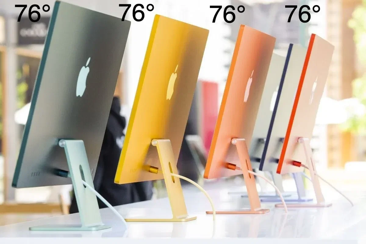
This one took me a while to believe was actually real.
See, every MacBook display in every Apple Store is set to exactly 76 degrees. Employees use a dedicated app to verify this. Seventy-six degrees is slightly too upright for a standing adult to see the screen comfortably.
So you reach out and tilt it back.
That's the whole move, and I think it's one of the cleverest things I've heard about retail in a long time. The physical act of touching the machine and adjusting it to suit yourself triggers what behavioral economists call the Endowment Effect: people value things more once they've physically engaged with them. You've adjusted the laptop. It is, in some small way, already yours. You're also feeling the weight of the aluminum hinge, which is exactly what Apple wants you to feel.
One degree. That whole sequence. I find that equal parts unsettling and impressive, and I'm not sure which one wins.
The Staff Aren't Salespeople
When Jobs and Johnson were figuring out how the stores would actually treat people, they didn't study other retailers. They asked who provided the best service in the world and landed on luxury hospitality: Ritz-Carlton, Four Seasons. The Genius Bar is a direct copy of a hotel concierge desk, which explains why it sits at the back of the store and why the folks working it are called Geniuses rather than technicians.
So Apple employees are trained on a protocol called A.P.P.L.E.: Approach, Probe, Present, Listen, End. The whole thing is built around getting a real conversation started before the customer can disengage. Apple staff open by asking what brought you in today. Open question. You're in a conversation now, whether you meant to be or not. Most stores default to "Can I help you?" which is a yes-or-no, and yes-or-nos let people say no and walk away before anything happens.
Geniuses also train on the Three Fs: Feel, Felt, Found. When someone comes in furious about a broken phone, the script runs: "I understand how you feel. I've felt that way too. But what I've found is..." Confrontation becomes collaboration. Yeah, it's manipulative. It's also genuinely good design for how to treat someone who's frustrated. I can hold both.
Three Eras, One Direction
The stores have gone through three distinct phases, and I think each one tells you something about where Apple thought it was in the culture. The first era, 2001 to around 2005, was clean white surfaces, stainless steel, maple floors, clinical but warm. The goal was stripping away everything associated with tech retail, which in 2001 meant fluorescent lights and beige carpet and a sales guy named Brad working on commission.
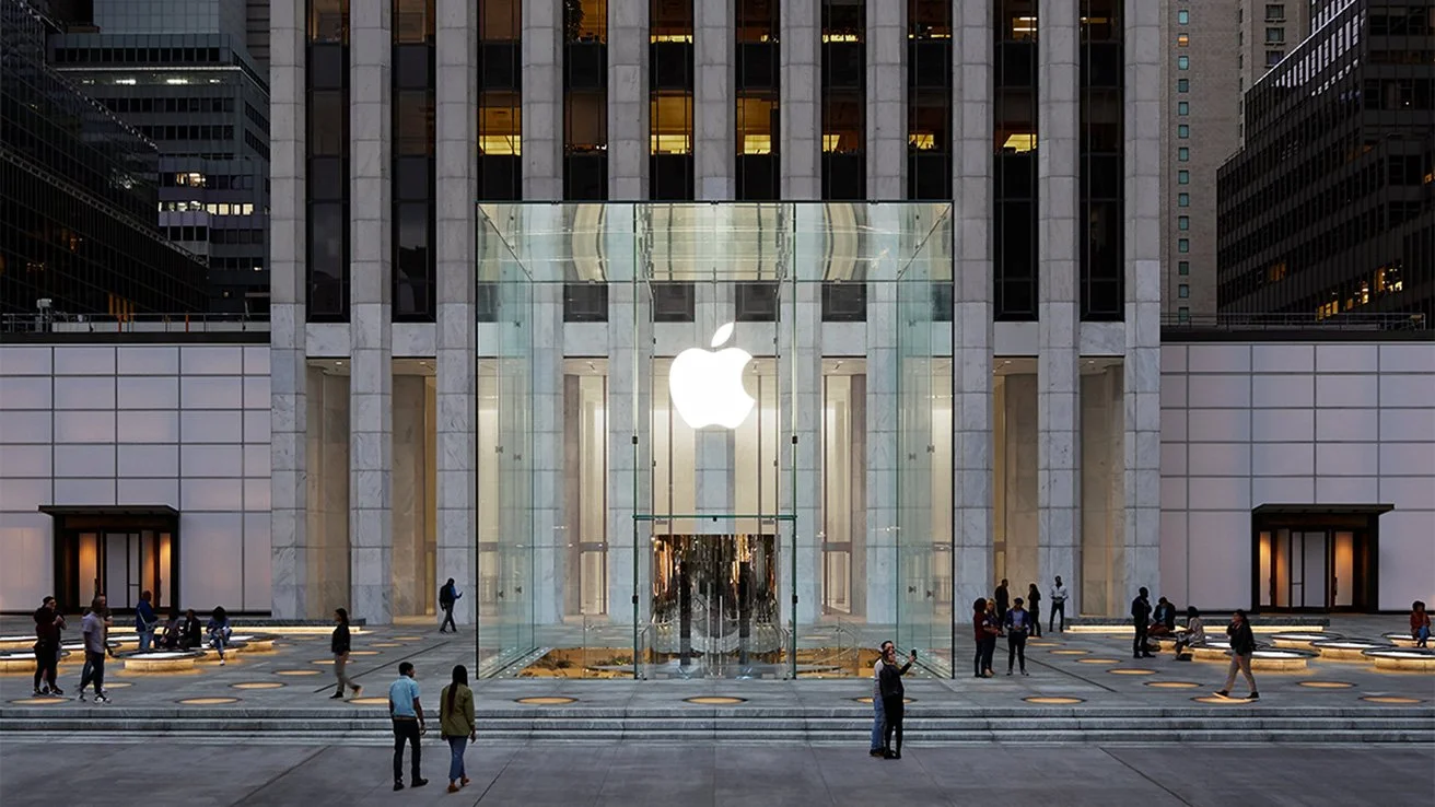
The second era was all structural glass, and I mean they went hard with it. The Fifth Avenue cube. The Shanghai cylinder. These were architectural billboards for a brand that had just become a cultural force. Apple patented the glass staircases, the specific panel configurations, the curved facades. Steve Jobs is literally listed as an inventor on glass architecture patents. That's how far they took it.
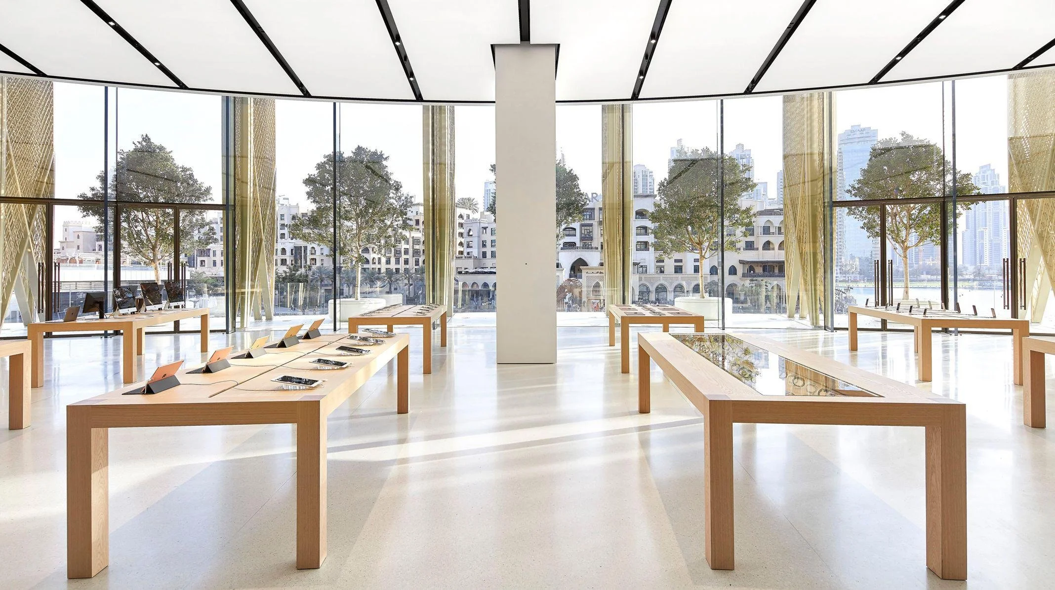
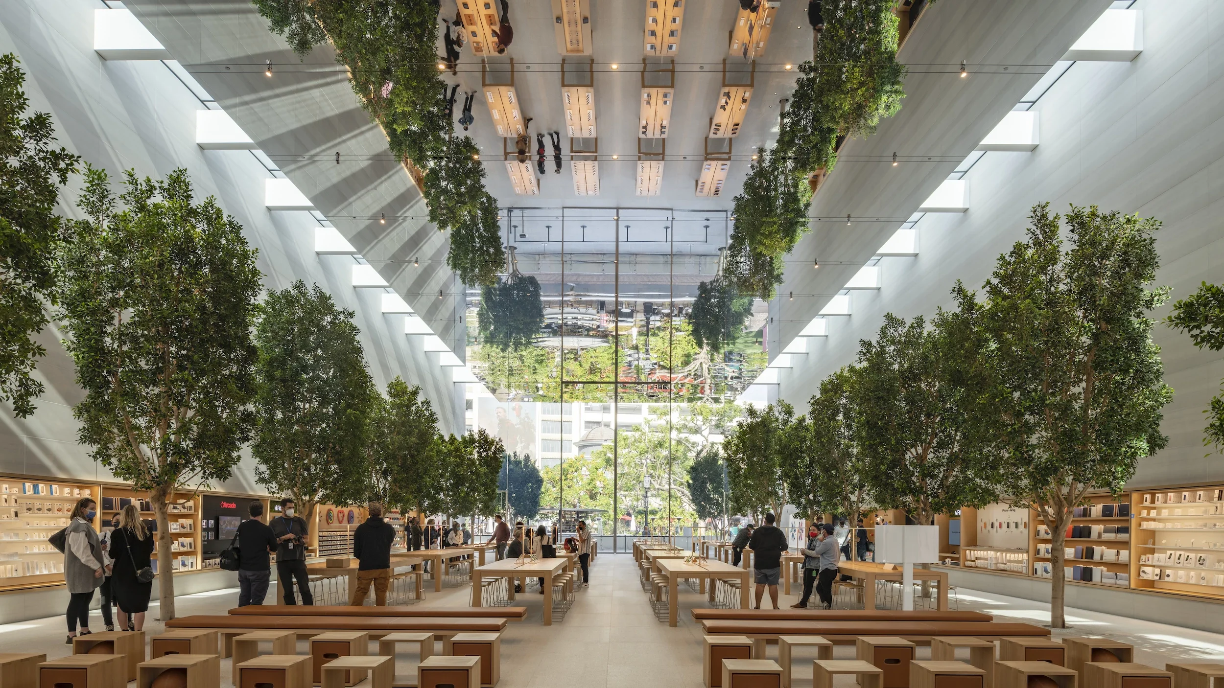
The third era, from 2014 to now, is honestly where I think it gets interesting. Angela Ahrendts came in as head of retail and reframed the whole mission: stores aren't shops, they're Town Squares. Foster + Partners redesigned flagship locations with massive sliding glass doors that dissolve the wall between store and street, limestone floors, live trees in the service area. The Genius Bar became the Genius Grove, which is either genuinely thoughtful or extremely on-brand, depending on your tolerance for that kind of thing.
"Today at Apple" came out of this era. Free hourlong sessions on photography, coding, music production. The whole play is to make the store worth visiting even when you're not buying anything. Foot traffic. Dwell time. Ecosystem lock-in dressed up as community programming. I'll say it's smart. Draw your own read on the intent.
What the Copycats Tell You
I mean, banks figured this out before most retailers did. Capital One, Chase, and Umpqua Bank all restructured their branches along the same lines: open floor plan, roaming employees with tablets, no teller windows, consultation tables. They called the staff "Universal Bankers." It's a direct copy of the Apple concierge model, just with worse lighting and way more pamphlets.
Tesla hired George Blankenship, the actual person who scouted Apple's real estate locations (worth sitting with), to build Tesla's retail network. Same premium mall addresses next to fashion brands, same non-commissioned staff, same product tables. Same whole playbook.
And look, I don't know what else to call it when your retail model gets replicated by banks and car companies: you've left your own category entirely. Retail consultants charge serious money to tell clients to do that. Apple just did it.
The Part That Doesn't Work
I'd be doing this wrong if I didn't say this part.
Glass, stone, steel, and wood reflect sound. Pack a busy flagship on a Saturday afternoon and the noise level is genuinely brutal. The Genius Grove with its trees and fabric ceiling is partly an aesthetic move and partly an acknowledgment that they built a beautiful cafeteria acoustic nightmare and needed to fix it.
The check-in anxiety is real too, and I've been in that confusion. When you remove checkout counters and service desks, you remove the cues that tell a first-timer where to go and what to do. Someone trying to get their phone fixed at a busy store can stand there genuinely lost, unsure which blue shirt to approach or where to stand. The place is built for people who already know how it works. For everyone else, kinda stressful, honestly. That's a conceit, and Apple knows it, which is part of why the third era has been quietly correcting it.
Every square inch of an Apple Store was a decision. The quarry in Tuscany. The screen angle. The question an employee asks when they approach you. The placement of the service area relative to the entrance. All of it is a system with one purpose: to make you feel, without being told to feel it, that you're somewhere worth being, touching things worth having.
BusinessWeek said in 2001 that Apple Stores wouldn't work.
Think about that.